Art Direction for M&S
When working as a freelancer, you’re never quite sure what work you will do next but sometimes you are lucky enough to get to work on a campaign that has real depth and meaning beyond just selling a product.
This campaign was that for me, an opportunity to concept and design a campaign that focused on the stories of those living with breast cancer, sharing how their networks, be it new or old, in person or digital, came together to help support them and truly make a difference in their lives. 25% of each sale made throughout the campaign also went towards funding breast cancer research, the tagline:
“Everyone can help someone.”
My role in this project was creating the overall look and feel and concept direction as well as the graphics and lockup used throughout the campaign. I made photographic recommendations that were handed on to the on-set art director, making image selects and retouching notes once the shoot was complete. My creative direction for the campaign itself was to move away from typically girly breast cancer awareness campaign, and do something that felt mature, real but also approachable and on-brand for M&S.


M&S Christmas 2019
This wasn’t just any campaign roll out…
It was M&S Christmas Campaign roll out.
I was brought on to roll out the selected campaign direction for Christmas 2019 in the Clothing and Home department, including way-finding signage, promotional offers, product stands, swing tags, and the windows for all stores. I was also tasked with art directing the product photography and advent calendar promotional materials and developed a variety of graphics and photographic signage for the Beauty department. The above all needed to stay within M&S’s existing signage rules and guidelines. Here’s just a few of the elements I designed for this project.


M&S
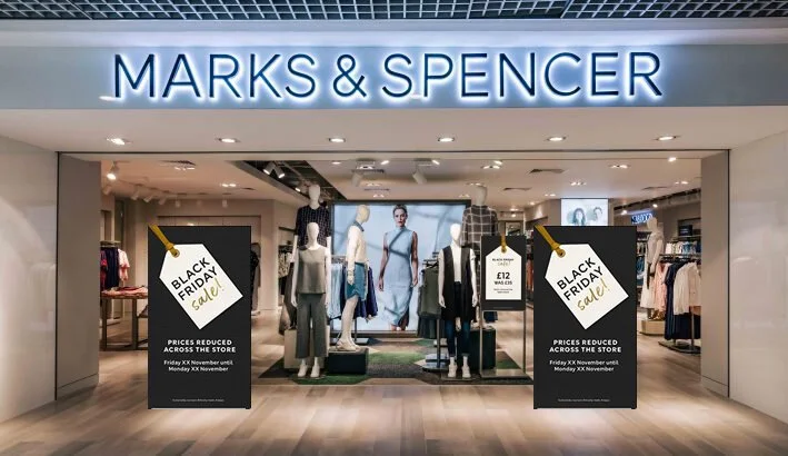
The Black Friday that never was. Classic 2020.
These are the concepts and graphic direction proposed by Leesa for M&S 2019 Black Friday. M&S later chose to not take part in Black Friday. Due to the timing of the Christmas 2019 campaign, the designs needed to tie into what would already be displayed in store at that time. Similar elements were used, including the swing tag shape, use of gold and gold glitter textures and the same handwritten typeface that was used in the Clothing, Home & Beauty Christmas campaign.
M&S
POS & Windows for Ramadan 2020
For the creative concepts and design for Ramadan 2020 at M&S, I was instructed to make it stylish yet different to previous campaigns, but still utilising the existing M&S signage formats and rules.
This concept is named ‘Dawn to Dusk’ because during the entire month of Ramadan, Muslims are obligated to fast every day from dawn to sunset or from dawn to night. It visually reflects this in the contrasting colours of salmon and deepest purple.
The arch shape reflecting the doorways, windows and details found inside a mosque is a continuous motif and becomes further simplified into a half circle, hinting at both the sun rising an setting, as well as the moon, which is usually a crescent at this time of year.
It’s a modern take, borrowing from Western trends in both fashion and design, using soft salmons that nod to dawn and dusk, textures that hint at tradition, muted golds and purple deep as the night sky for contrast.
This contemporary interpretation stands out from what M&S have done previously and from other retailers who are taking a more traditional route, and appeal to the customer base who are known for keeping up with trends.


